Just recently, Pantone announced their 2026 Color of the Year: Cloud Dancer. And people have opinions.
Some call it timeless. Others call it "the color of nothing." The design world is split (which, if you've followed Pantone announcements before, is pretty much tradition at this point).
Love it or hate it, Cloud Dancer is about to be everywhere. And if you're thinking about a mural or signage project in the next year, it's worth understanding what this color actually does, and whether it belongs on your walls.
What Is Cloud Dancer?
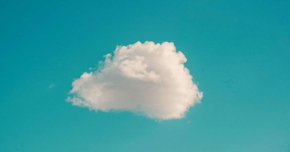
Cloud Dancer is a warm, creamy off-white with subtle undertones that shift depending on the light. It's not stark white. It's not beige. It sits somewhere in between soft, neutral, and deliberately understated.
Pantone describes it as "a quiet color that speaks volumes," which is either poetic or irritating depending on your tolerance for marketing speak.
Why Is It Controversial?
Because it's safe. And for many, it's boring; the color equivalent of choosing "maybe" when someone asks for your opinion.
And fair enough. After years of bold color choices; Viva Magenta, Very Peri, Classic Blue, Cloud Dancer feels like Pantone took a step back. Some designers see it as a retreat. Others see it as a reset.
The defenders argue that neutrals are having a moment. That after years of maximalism, people want calm. That Cloud Dancer isn't boring, it's versatile.
What This Means for Murals and Signage
Cloud Dancer as a background color is actually pretty great for murals. It's warm enough to feel intentional (unlike stark white, which can read as "unfinished"), but neutral enough to let other colors pop. If you're commissioning a mural with bold imagery or vibrant brand colors, a Cloud Dancer background gives you contrast without competition.
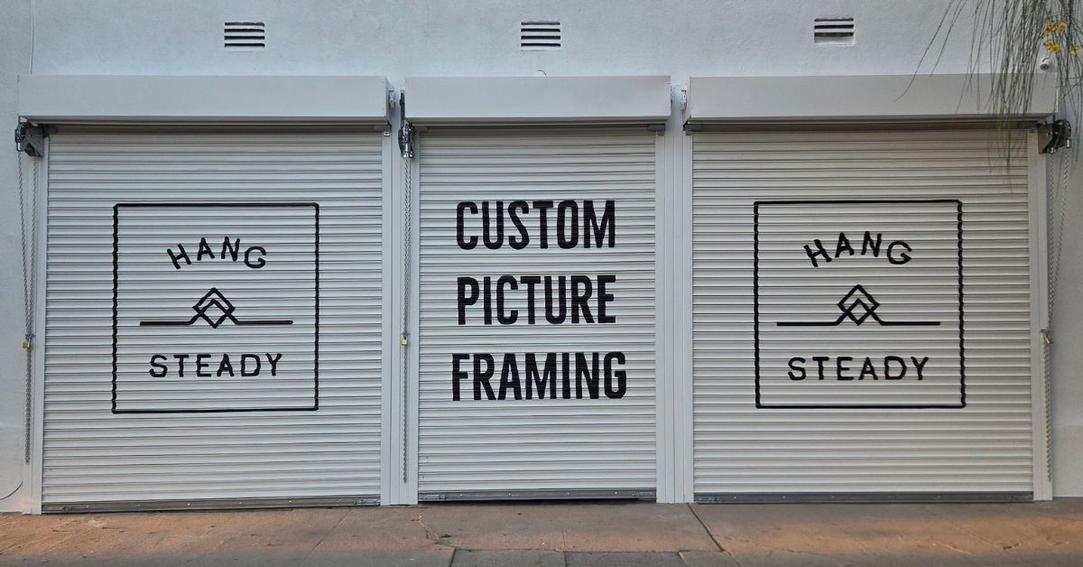
For signage, it works well in environments where you want sophistication without sterility. Think boutique retail, wellness spaces, upscale restaurants. It reads as premium without trying too hard.
Where it doesn't work: anywhere you need to grab attention from a distance. Cloud Dancer is not a "stop and look" color. It's a "come closer" color. If your signage needs to compete with a busy street or a crowded strip mall, this isn't your shade.
How to Use It
If you're incorporating Cloud Dancer into a project, here's what we suggest:
- Pair it with warmth. Cloud Dancer plays well with terracotta, rust, ochre, and deep greens. The warm undertones in the white pick up those earthy shades and make the whole palette feel cohesive.
- Use it to soften bold choices. If you want a mural with high-impact colors but don't want it to feel overwhelming, Cloud Dancer as negative space gives the eye a place to rest.
- Consider the light. This color shifts. In warm afternoon light, it glows. Under fluorescents, it can look flat. If your space has natural light, you're golden. If not, test it first.
- Don't use it alone. A wall that's just Cloud Dancer is a wall that disappears. It needs something to anchor it; a graphic, a logo, a contrasting element. Otherwise, you've just painted your wall "slightly off-white."
The Takeaway
Cloud Dancer isn't going to be the hero of your mural. But it might be the thing that makes your hero look better.
It's a supporting player and sometimes that's exactly what a project needs.
At Pulling Paint, we've been mixing and matching Pantone's picks with client visions for years. If you're curious how Cloud Dancer (or any color) might work for your space, let's talk.


